Yarn
Chat fiction: thriller stories told one text message at a time.
What it is
Short fiction told as a text thread. You tap to see the next message, like you've picked up someone else's phone.
Problem
Teens like stories, but a wall of text on a phone asks for more attention than most people give it. Yarn made each text message the unit of reading. One tap, one line, and it feels like reading over someone's shoulder, not sitting down with a book.
My role
Yarn was the first app I helped Mammoth Media build, starting from nothing. I began as its designer and became VP of Product, and I stayed the principal designer the whole time. Every screen here is mine. I also helped come up with the tap-through video format and led monetization, including the in-app currency and the subscription.
Outcome
60 million stories and 8 billion messages read. The average reader opened Yarn four times a day, spending close to an hour in their first week. Yarn ranked consistently in the US Top 50, Mammoth's apps reached more than 30% of US Gen Z, and Yarn's revenue helped the company raise a $13M Series A.
Case study
Onboarding
The app used to drop you straight into a story, and it was always horror.
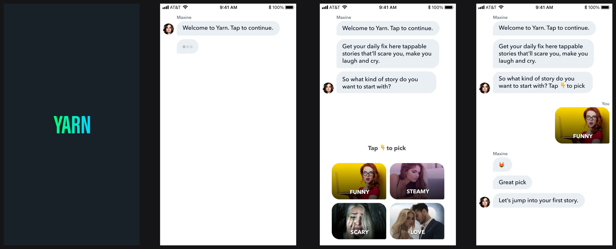
A genre picker, in words
Testing showed that whether someone stuck around depended heavily on which genre they landed in, and horror isn't for everyone. So now the app starts by asking what you're in the mood for. We used words instead of cover art on purpose. At that point you don't know any of these stories, so a grid of images is just noise.
Case study
Discovery
Getting people to find their next story was critical to retention.
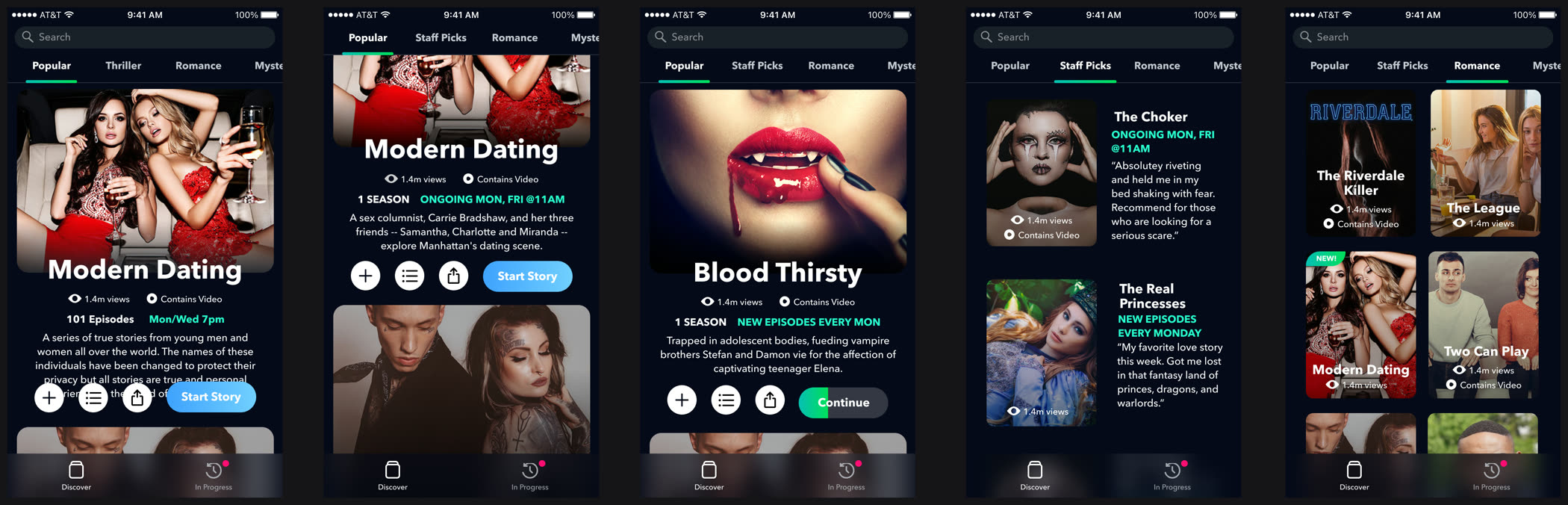
Five catalogs, A/B tested
We tested several catalog layouts against each other, plus different cover art for each story to see if the image alone changed clicks. The result was simple and a little humbling for a designer: the layouts that fit the most stories on screen won.
Case study
Paywall iterations
Yarn was free to start and paid to keep reading, so the paywall was where the business either worked or didn't. We tested a lot of them.
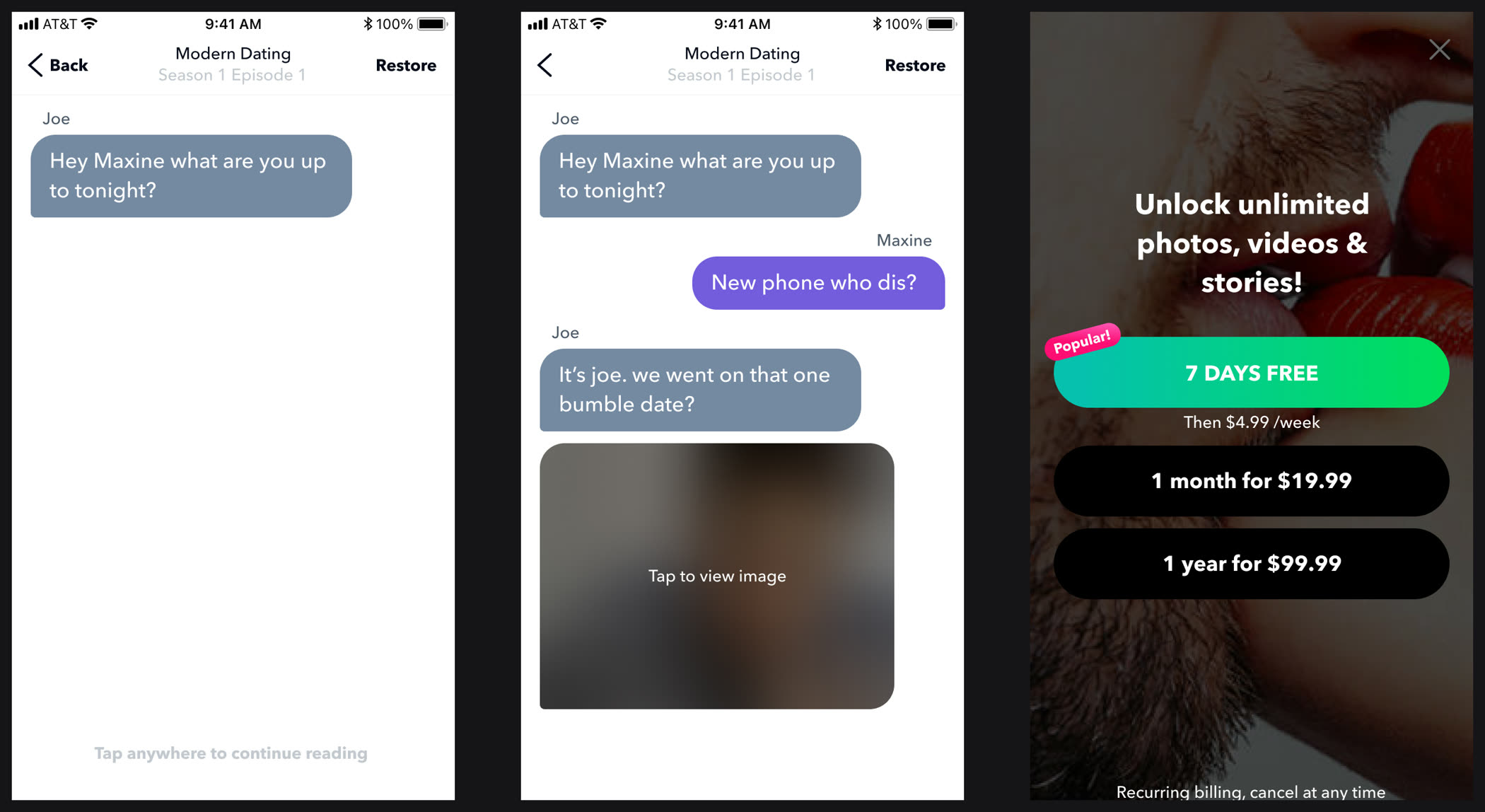
The blurred image
The best performer wasn't a wall at all. It was a blurred image dropped into the story, with an offer to pay to see it. It worked because it showed up while you were already hooked, and wanting to see one specific image is a much smaller ask than a subscription.
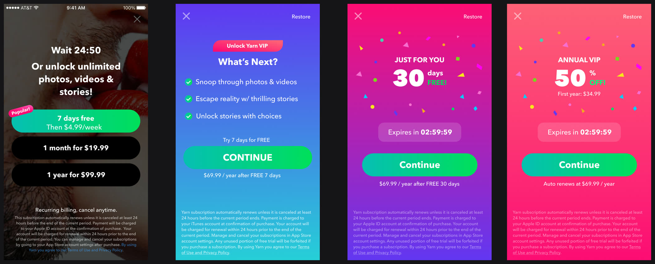
Walls, timers, trials and offers
We also tested the usual options: a plain subscription wall, a softer version, a countdown offer and a free trial. Each one is a different guess about why someone hasn't paid yet, and testing them against each other is how you find out which guess fits your audience.
Case study
New content formats
Two experiments with what a story could be besides a text thread.
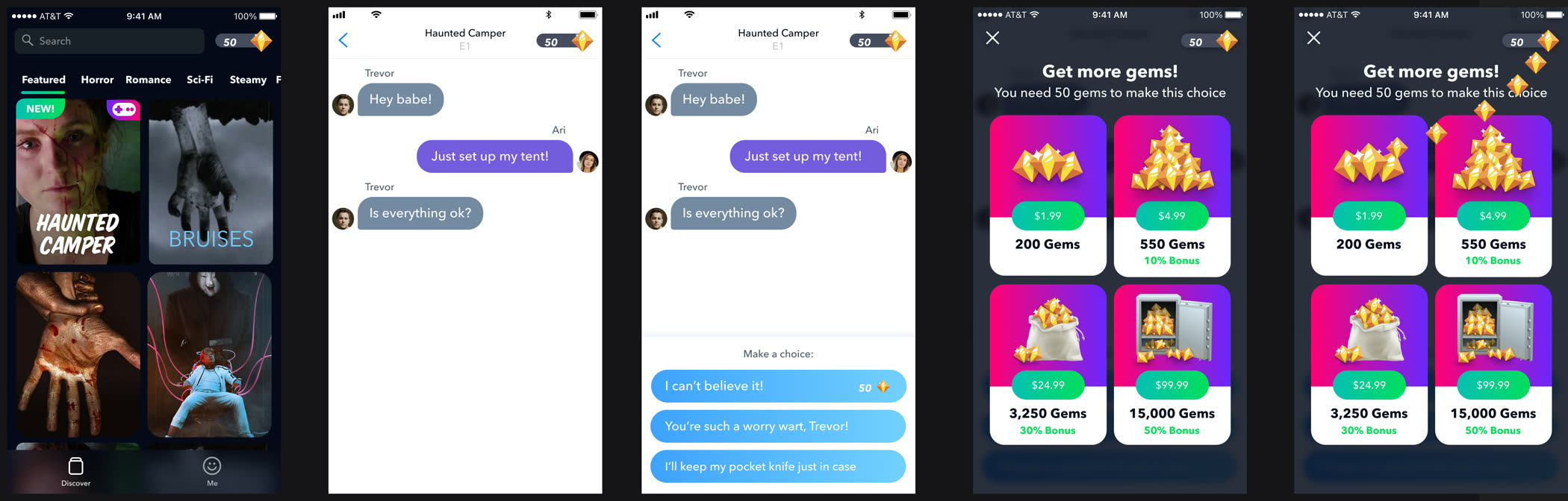
Gems and choose your own adventure
I spent a long time working out how a gem currency could fit into branching stories, with some paths free and the better ones costing gems. The choice shows up inside the conversation with a price on it, so you decide whether to spend right when you most want to know what happens next.
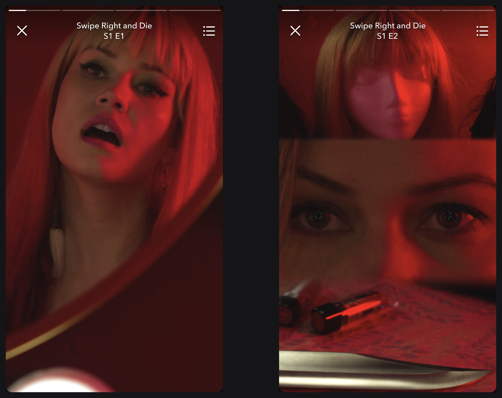
Full-screen short-form video
I pushed hard to turn text stories into full-screen video. It drove millions of views and a lot of installs, and the format outlived the app. Readings of these stories still circulate on YouTube.