Attention
Personalized doses of wisdom, delivered when you need them.
What it is
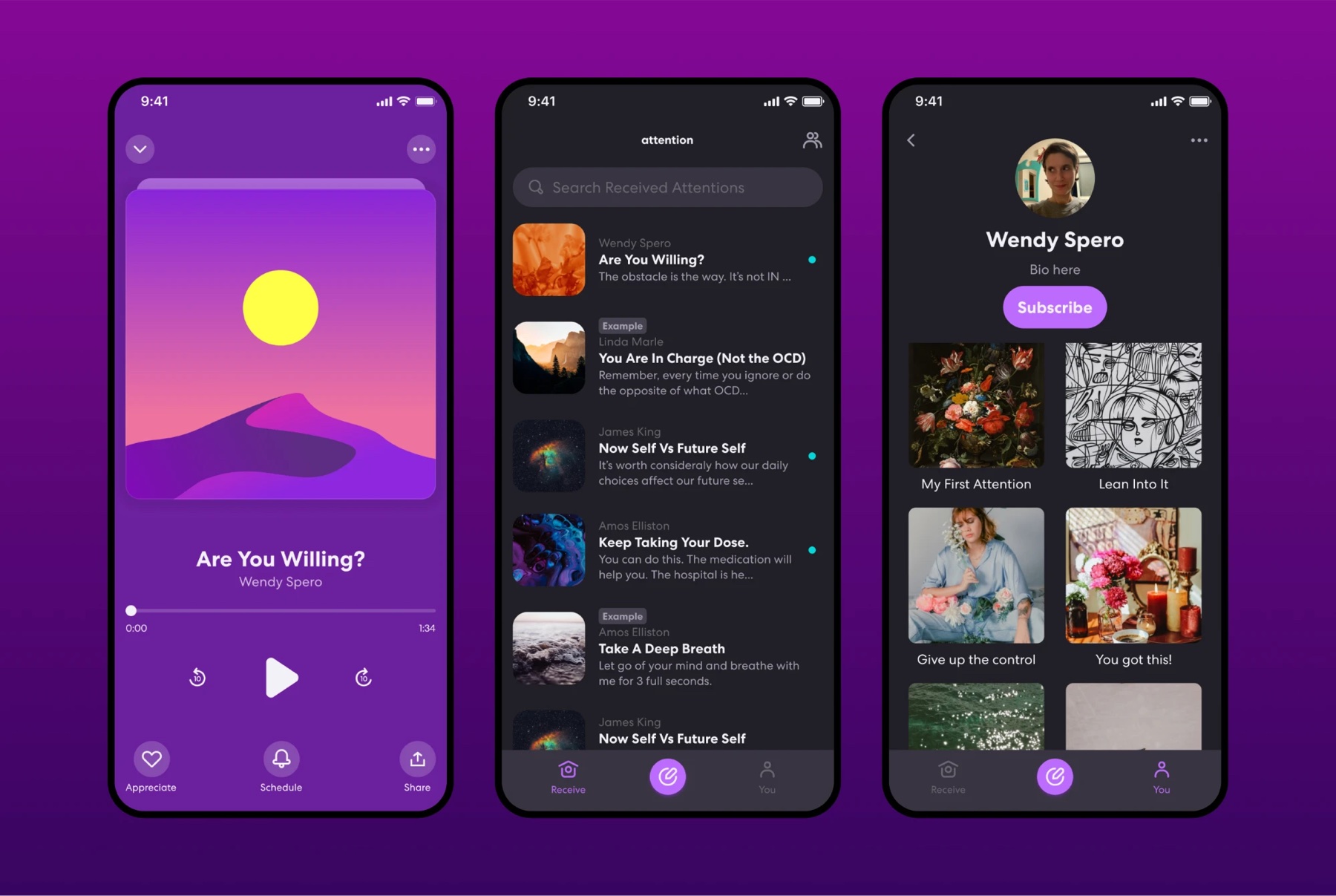
An iOS app for mindfulness and motivation. You get short audio pieces, called attentions, from friends, coaches, wellness experts and meditation teachers, or you record and schedule your own. They arrive as notifications timed to when they'll help, and you can keep them private or share them with a community.
Problem
Good advice is easy to find and hard to remember when you need it. You read something helpful, and by the time the moment comes, it's gone. Attention is built around timing: guidance in a voice you trust, showing up when it's useful.
My role
I worked closely with the founders to design the app from scratch, and I created the logo and brand.
Outcome
A 5.0 rating from 167 App Store reviews.
Case study
Choosing a home feed design
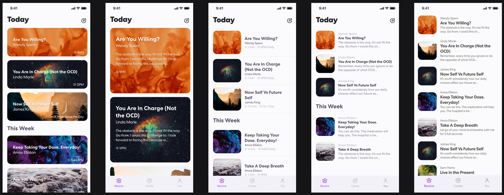
We wanted every row to carry the artwork and a quick sense of what the attention was about. The version that shipped is the densest one: a small square thumbnail, the sender above the title, and the first line of the text under it. The image-led versions photograph better, but they fit one or two attentions on a screen and tell you almost nothing about what is inside them.
Case study
Versions of the player
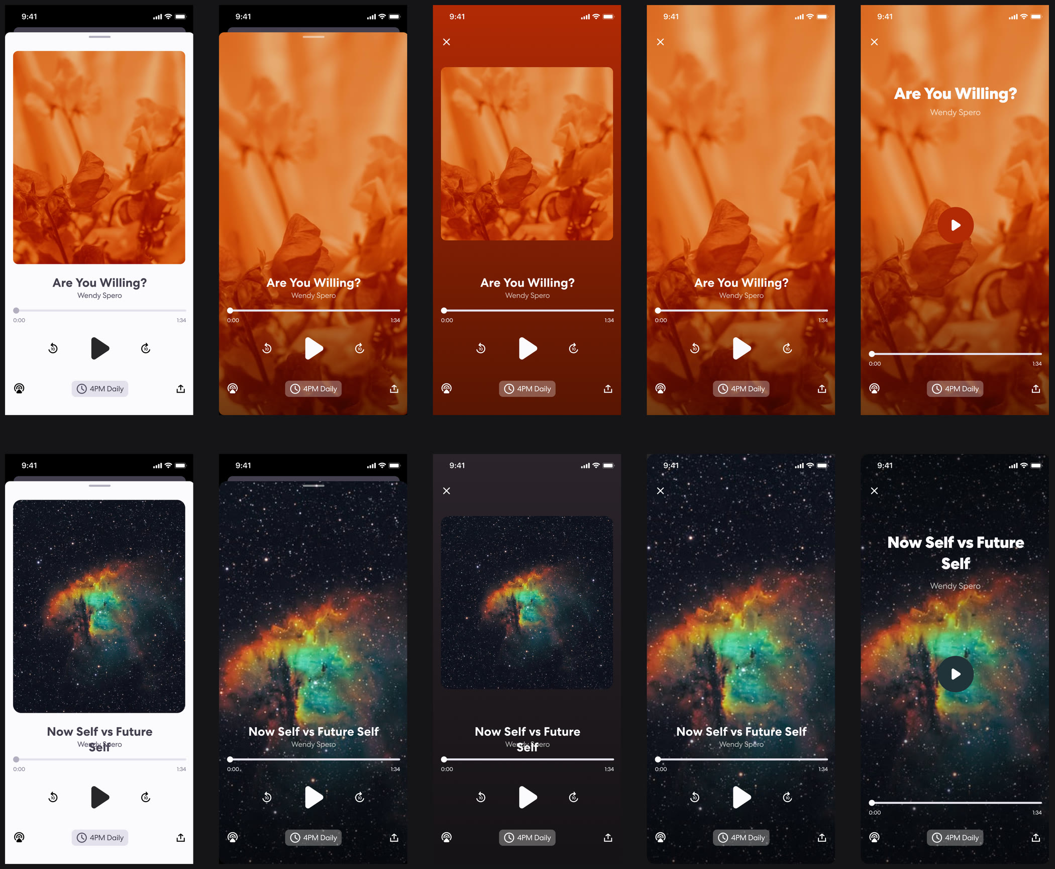
The player decides whether the app feels calm or feels like a podcast app. I designed five directions and tested each one against different artwork to make sure it held up.
Case study
Versions of the create flow
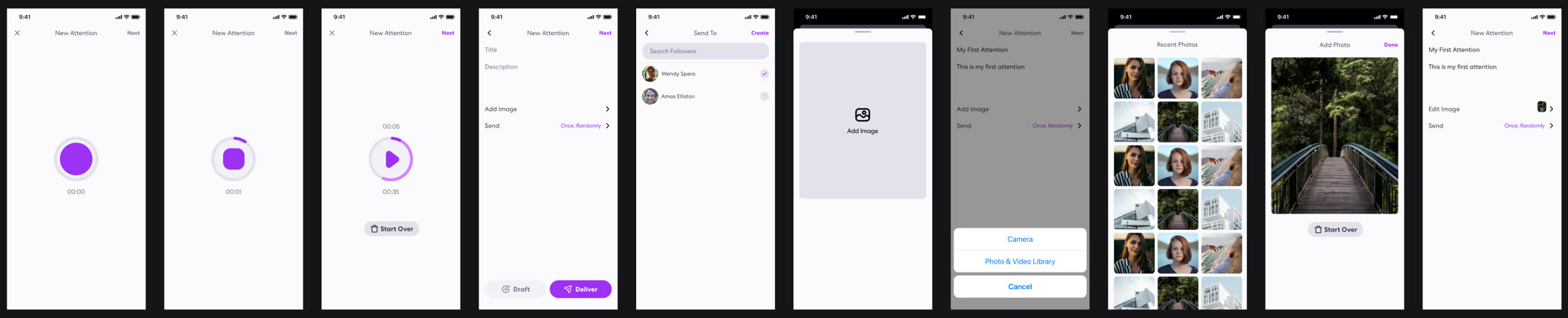
Making an attention means recording audio, writing a title, picking an image, and choosing who gets it and when.
Audio first
The first version opened on the recorder, because recording seemed like the most important part to get right. From there you added a title, a description, the audience and an image.
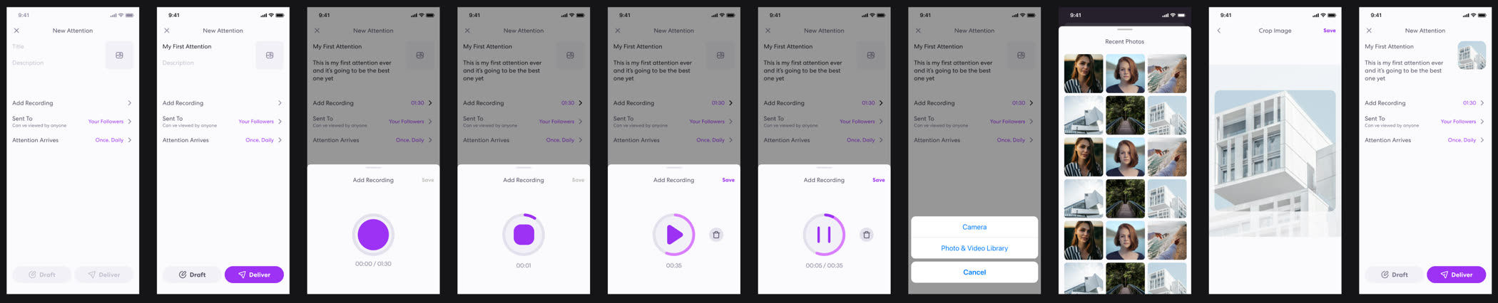
Title first
In practice, people found it easier to start with the title and image. Those set the tone for the recording and are the easiest place to begin, and a big record button on the first screen was intimidating. So the recorder became a sheet you pull up once you know what you're making.
Case study
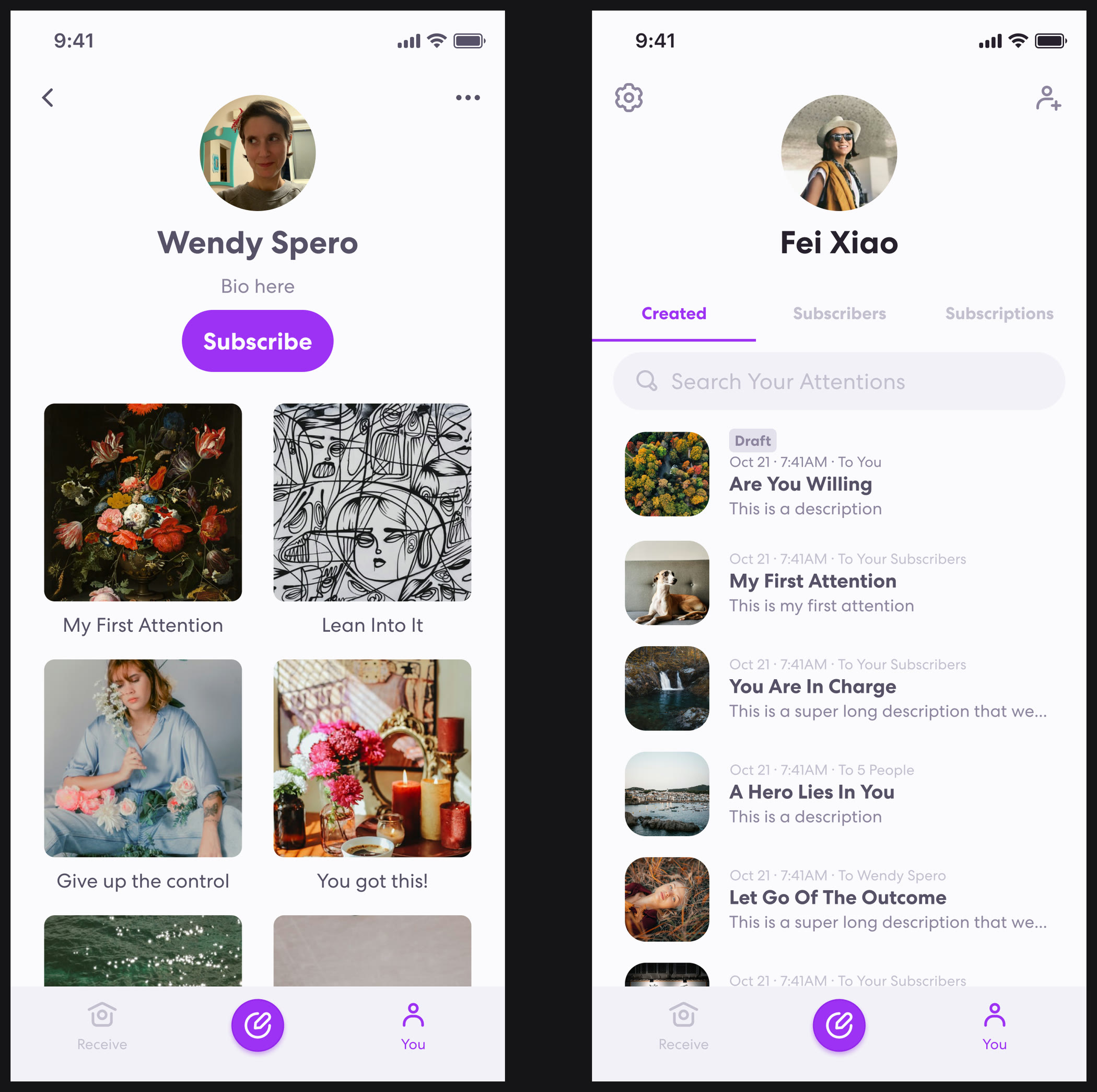
Profiles
The same screen does two jobs depending on whose profile it is. On someone else's, you're deciding whether to subscribe. On yours, you're keeping track of what you've made and who received it.
Case study
Logo and brand
The mark had to hold at 1024 pixels on the App Store and at 24 inside a tab bar and still read as the same thing. I drew everything first, narrowed to twelve, then built two complete directions around the finalists before picking one.
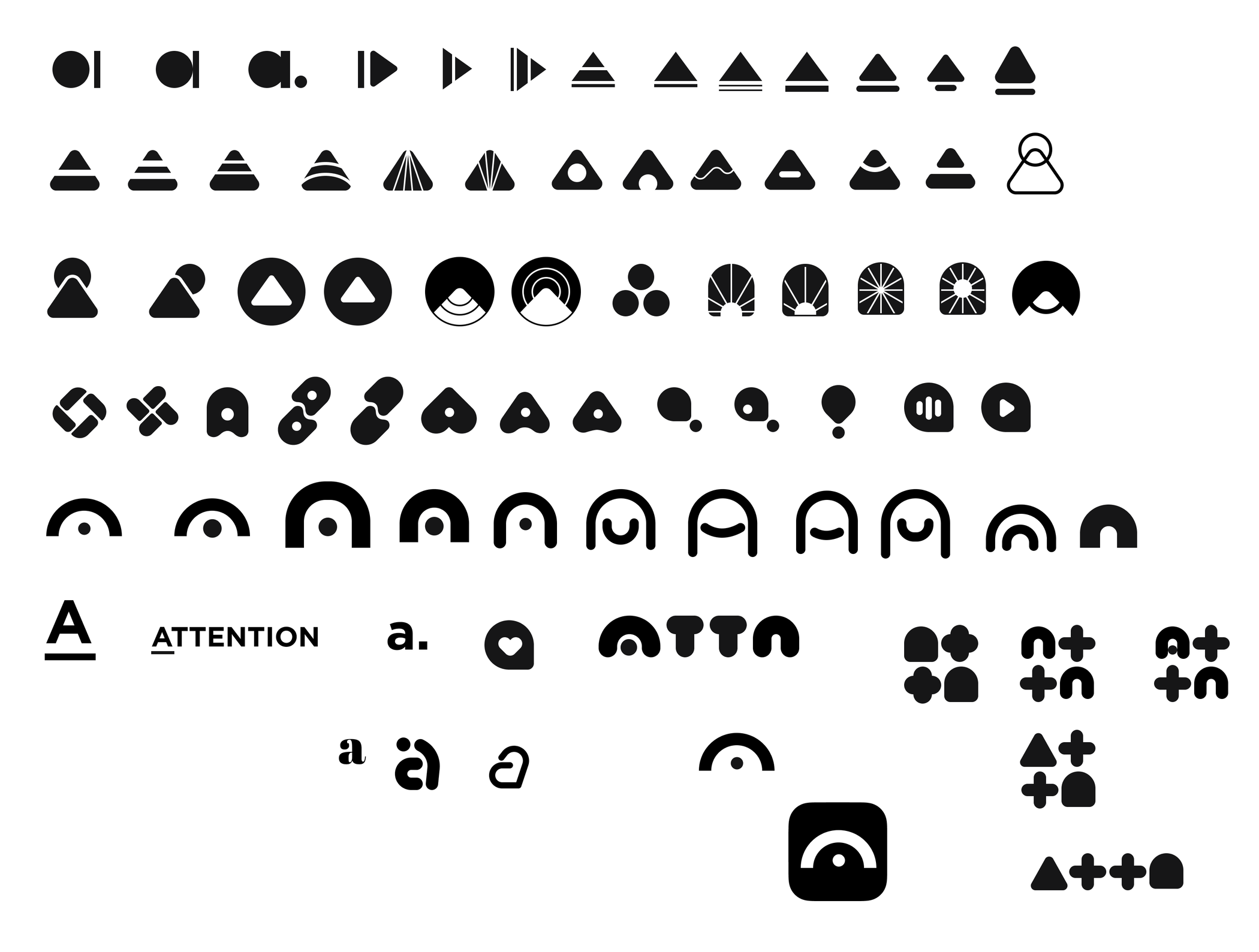
Drawing everything first
About eighty marks in one sitting, grouped by idea, not quality: a play triangle, a sound dome, an arc, a speech bubble, a lowercase a, the letters packed into a block. A sheet like this gets the obvious ideas out early, which leaves room for a better one.
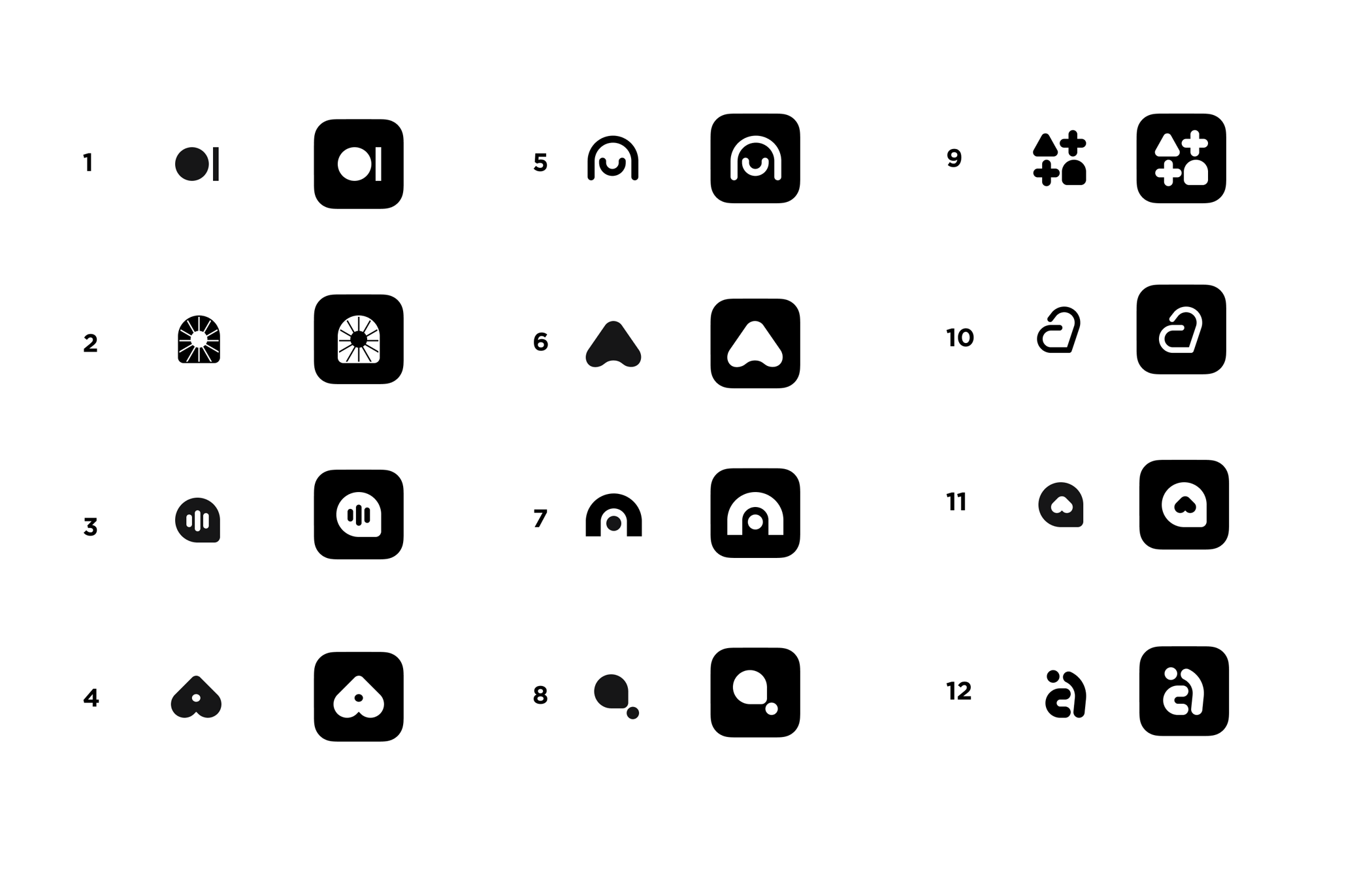
Twelve finalists, cut as app icons
A mark that works on a page can fall apart in a rounded square at real iOS icon size, so I made each of the twelve as both a symbol and an icon. That's where several of them died. The detailed ones turned to mush, and the thin-stroke ones disappeared. The simplest shapes survived: a circle with a dot, a dome, a filled triangle.
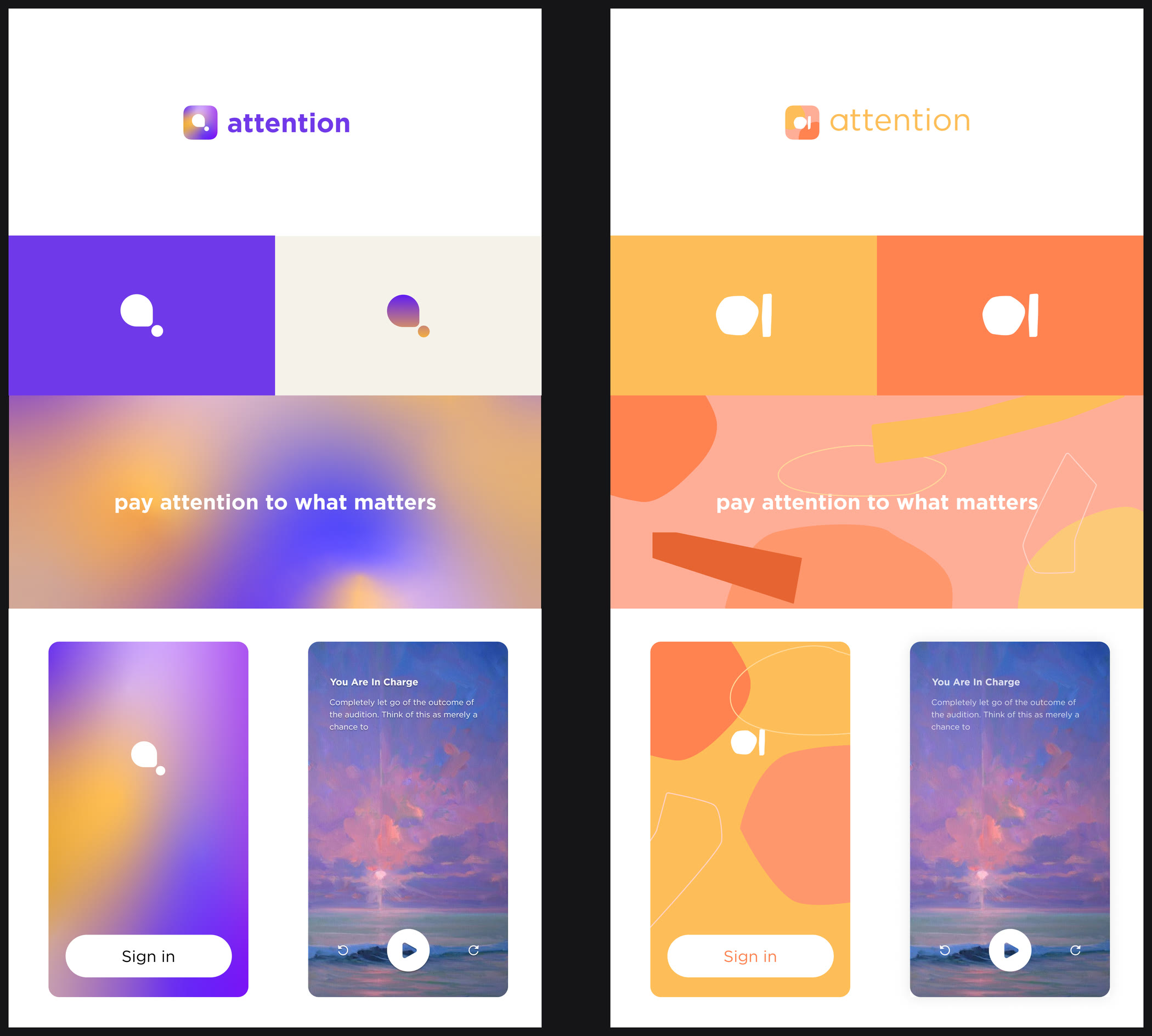
Two directions, taken all the way
You can't judge a mark in isolation, so I built out both finalists with a wordmark, color pair, pattern, and the first two screens a user sees. The purple direction, the circle and dot, is the one we shipped, and the app screens above use it. The orange was warmer and more editorial, but the purple gradient made the product feel calm instead of loud, and calm was the whole promise of the app.