Houseparty
Group video chat you drop into. No scheduling, no ringing.
What it is
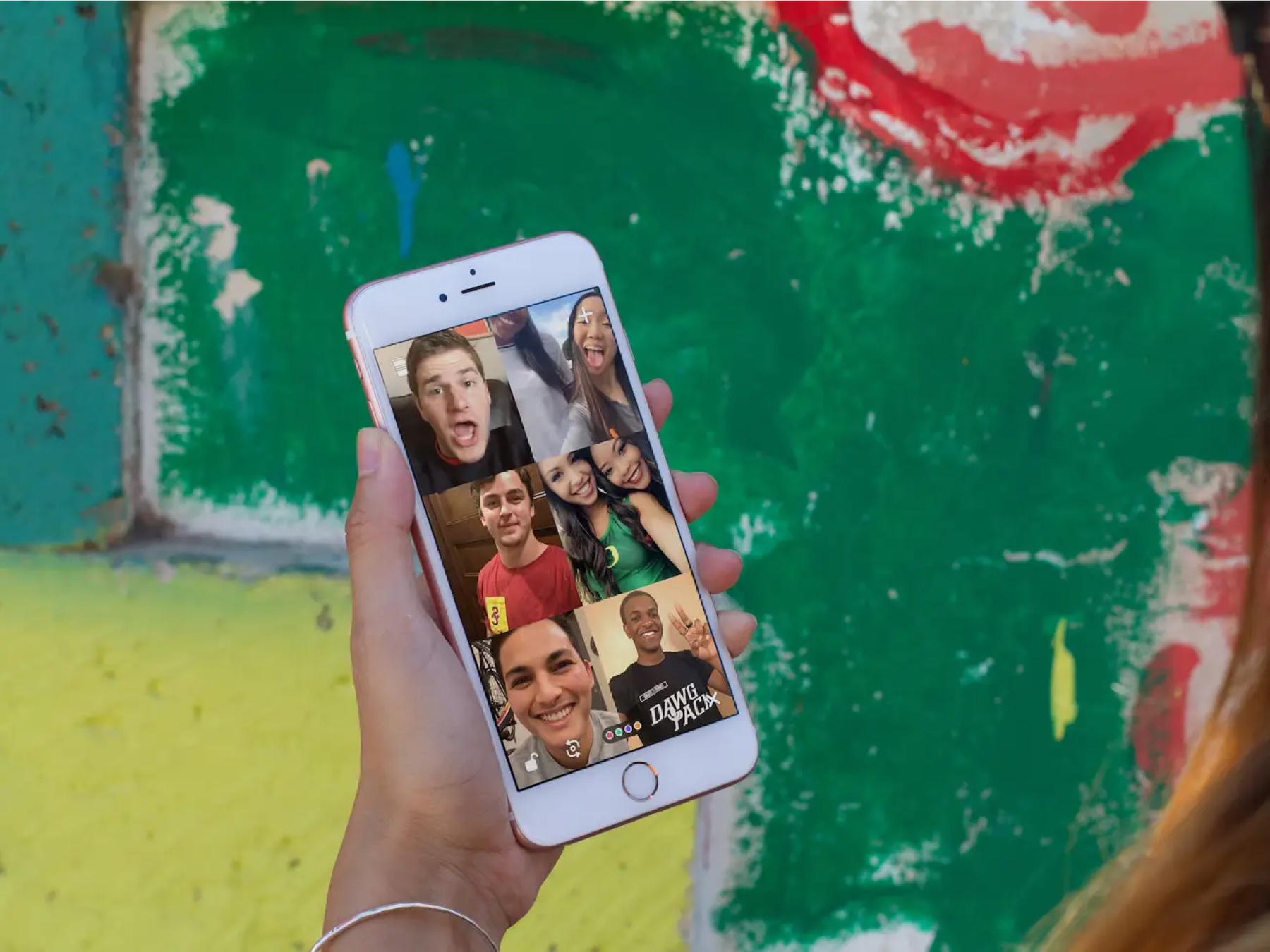
A group video app where you could see which friends were around and jump into their room, without calling anyone.
Problem
Houseparty set out to solve loneliness: how do you stay close to friends who aren't nearby? Video calls take effort because someone has to set them up. Houseparty tried to feel like an actual house party instead, where people drift in and out and nobody needs an invitation.
My role
Second designer, reporting to lead designer Jakub Swiadek. I designed sign-up and onboarding and the room UI, and worked with a small product team on the "Say Hi" feature. I also shaped the early brand and color. Later I took on PM work too, owning video and room quality.
Outcome
While I was there, the app hit #2 overall in the free App Store with no paid marketing and passed a million downloads in its first month. It later grew to hundreds of millions of users, became the #1 social app in 82 countries, and was acquired by Epic Games in 2019.
Case study
Getting you to a friend as fast as possible
The hardest problem in a social app is the moment you're there alone. We solved it with a friend graph and notifications built around it.

Onboarding with friends
Right after sign-up we showed you a friend request with a small animation, so the first thing you saw was someone wanting you there. Next came the contacts permission, which let us suggest people you actually knew. The first round of suggestions came from your contacts, and the second came from the friends of whoever you'd just added. Then you landed on your own camera, waiting, which is where most people quit on their first session. The boldest move was notifying everyone you added that you were in the house. It was aggressive, but it's what kept people coming back.
Case study
The lonely state
One of the most important screens in the product was the one where nobody had shown up yet.
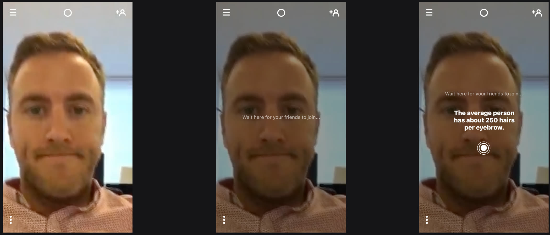
Three passes at waiting alone
Opening straight onto your own camera was too jarring. An overlay and a line of loading text helped, but you were still staring at yourself, sometimes for a full minute. The version we shipped adds a rotating fun fact and a loading ring, so the wait feels like the app is doing something, not like it's empty. We also wanted the screen to be fun enough to screenshot and share.
Case study
How to show the rooms
Joining a room was the whole product, so the list of who was around had to be reachable without leaving your own camera. We designed several versions and tested them with real users.
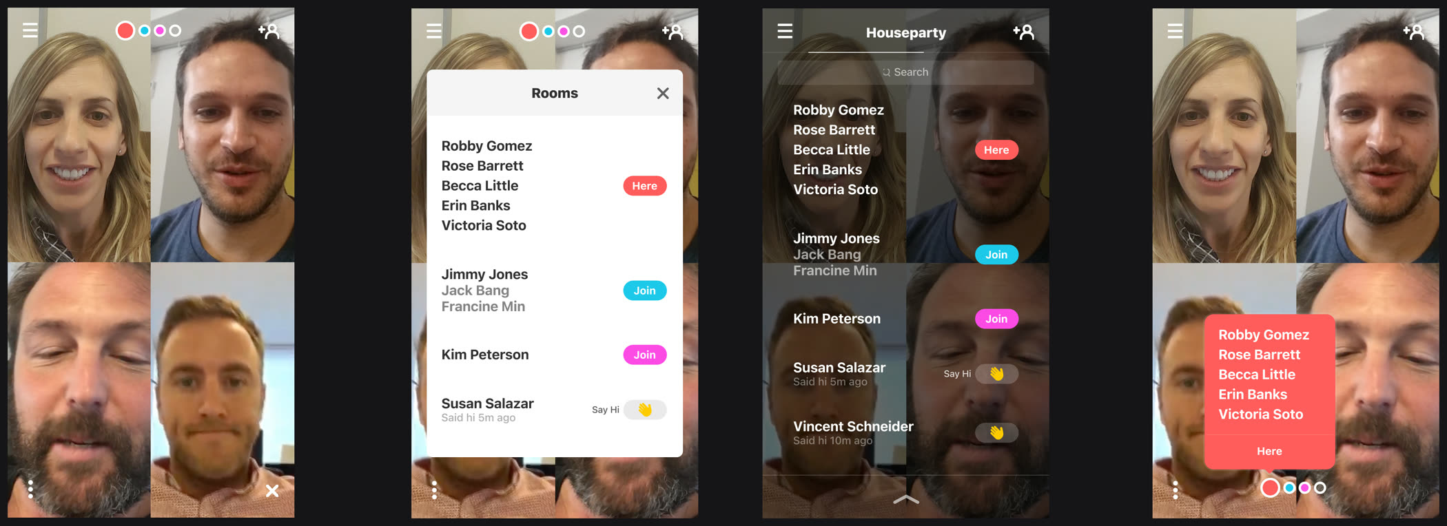
Four ways in
We shipped the dark panel. It was the only version where you stayed on camera and could see every room open to you, and who was in each one, at the same time.