Towns
A messaging app and protocol for private groups, with paid membership, on-chain access and trading built in.
What it is
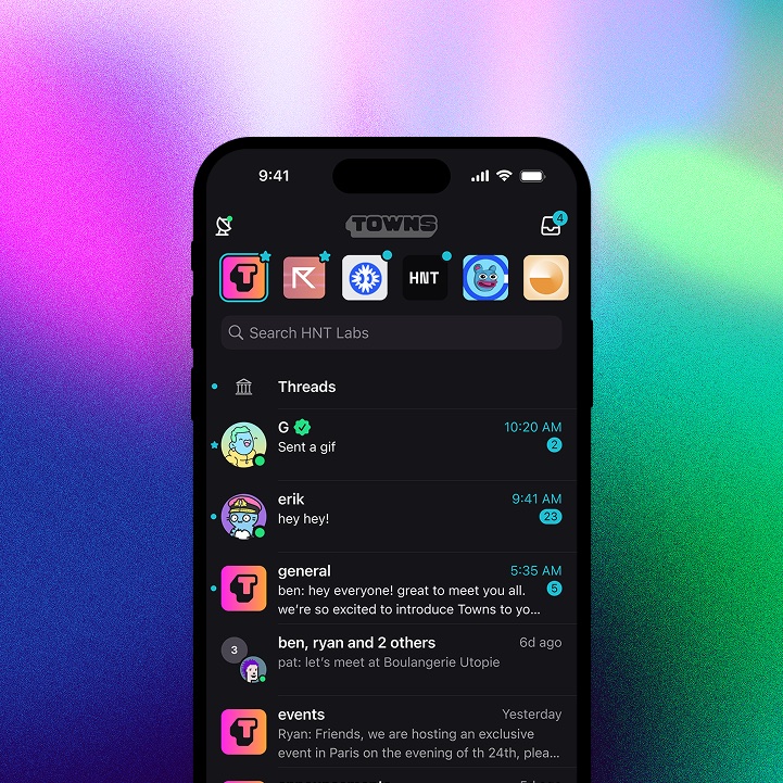
Towns is a messaging app for private groups. Members pay to join, membership lives on-chain, and the group's money tools sit inside the chat.
Problem
Groups that talk about money online keep the conversation in one place and the money somewhere else. They discuss a trade in chat, make it in another app, then a bot posts the result back. Towns puts all of it in one place.
My role
I led product design: strategy, roadmap, every UX flow, and the design system behind them. I was also the brand designer and ran all creative. I worked with engineering to ship features end to end, and I was in the file every day drawing screens and building prototypes, not just reviewing them.
Outcome
$39M+ in protocol revenue, 445k+ towns created, 1.63M memberships, and WAU/MAU holding at 70%.
Features shipped
What I designed and iterated on over four years. A few are covered in depth below.
- Create town
- Town store
- Discovery
- DMs
- Crypto wallet
- Staking
- Tipping
- Bots and developers
- Roles and permissions
- Gating towns by NFTs
- User reviews
- Notifications
- Compliance
Case study
The town page, redesigned
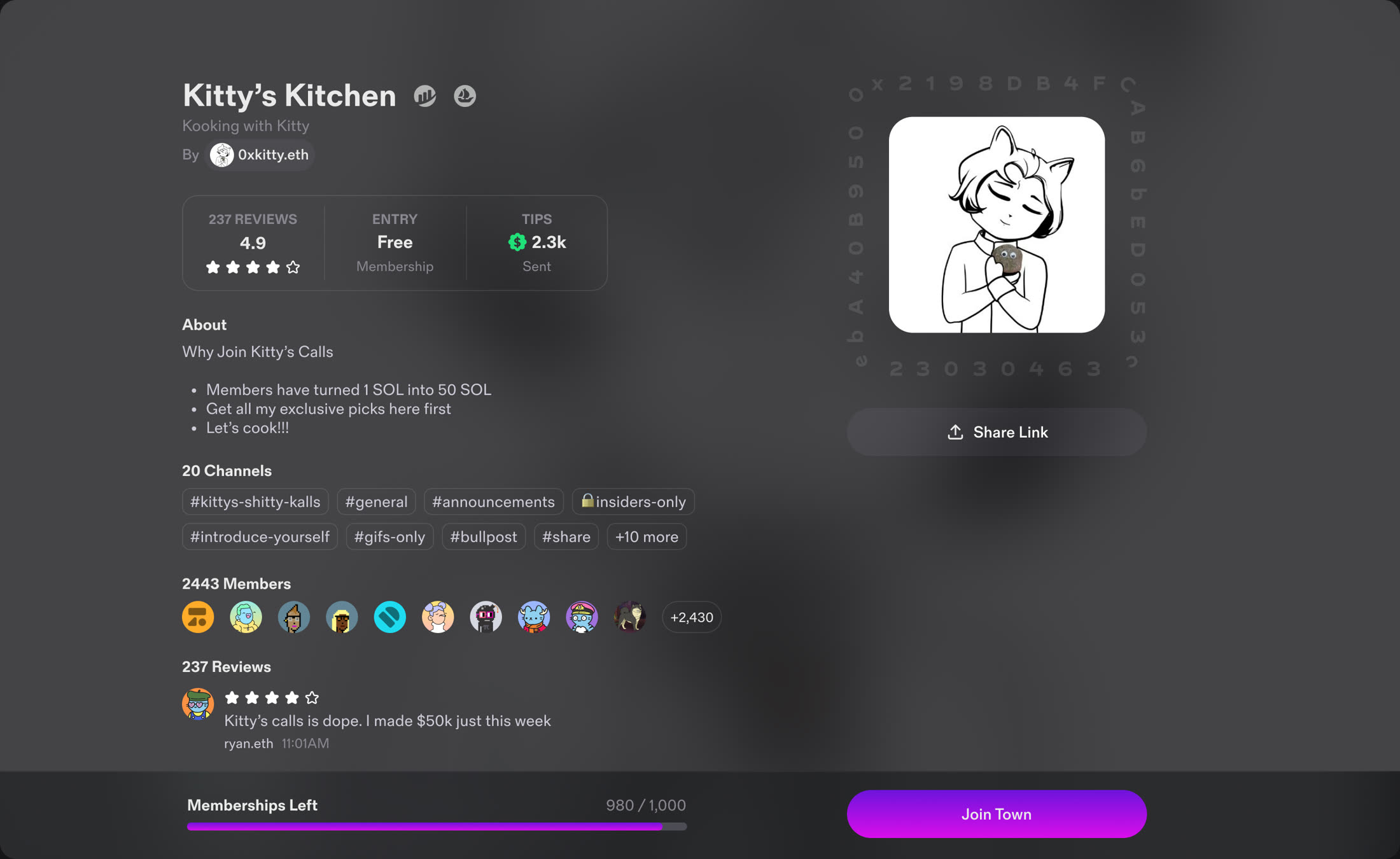
The town page drove most of our creators' growth, and creators told us they needed a better way to sell their town.

 V1 · Before
The page a member lands on
V1 was modeled on the App Store. It explained what a town was but gave the creator almost nothing to sell with. V2 leads with the creator's own media, shows what you get right next to the price, and adds an FAQ and a space for the owner to introduce themselves.
Case study
Town creation, redesigned
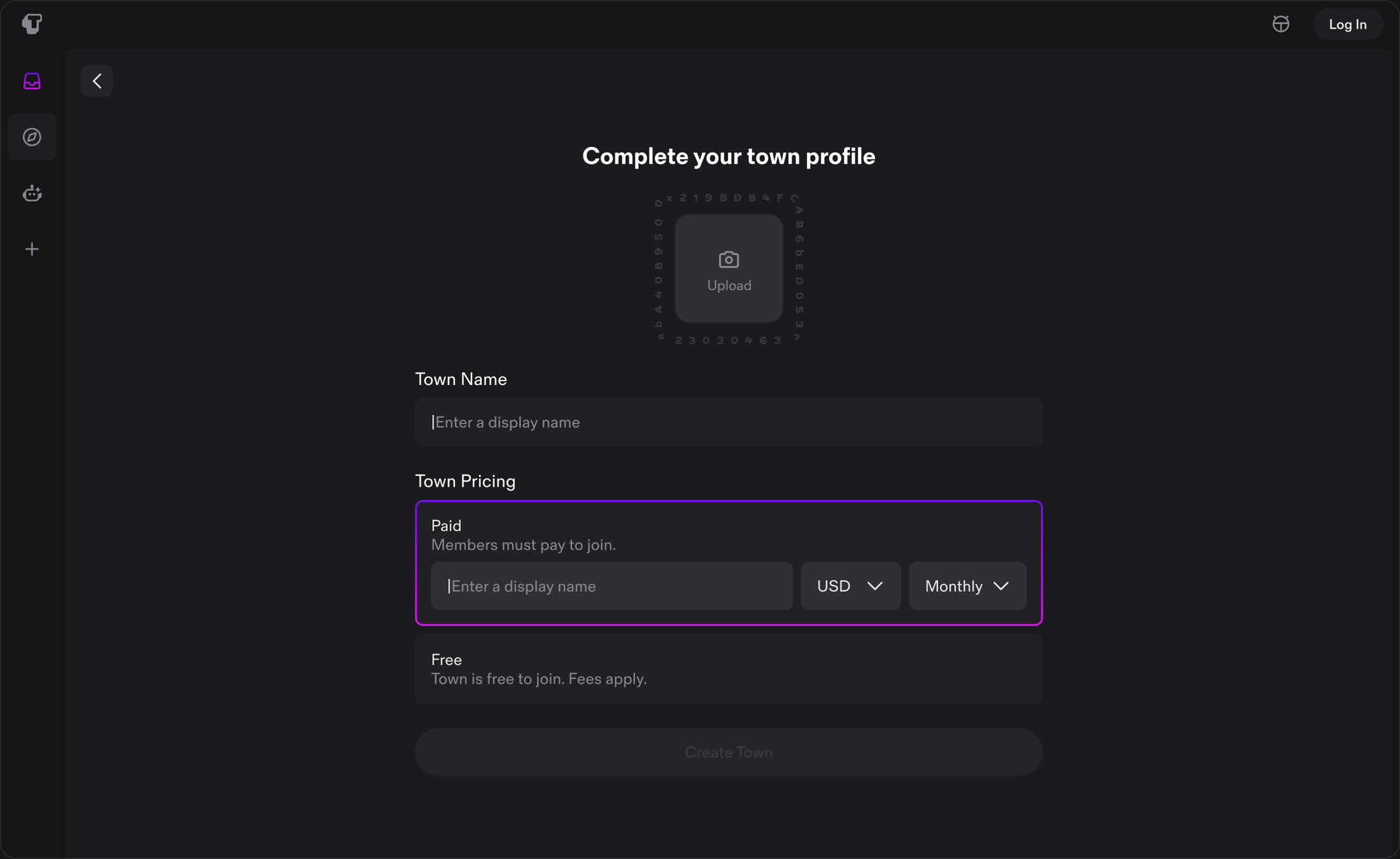
We wanted more people to get all the way through creating a town.
 V1 · Before
Creating one
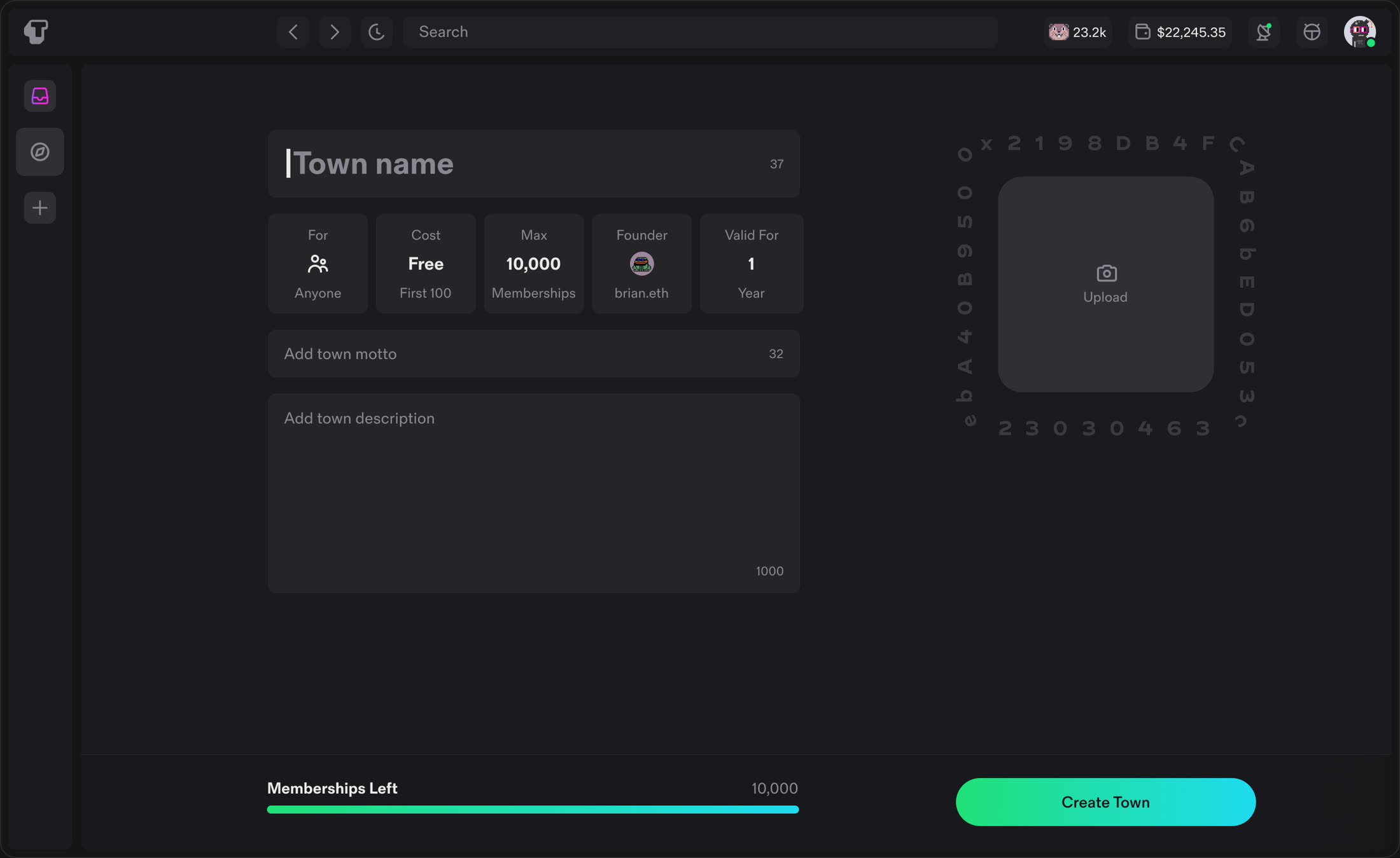
V1 asked for too much up front. More than 95% of new towns never used the extra options, so we cut creation down to a name and a price.
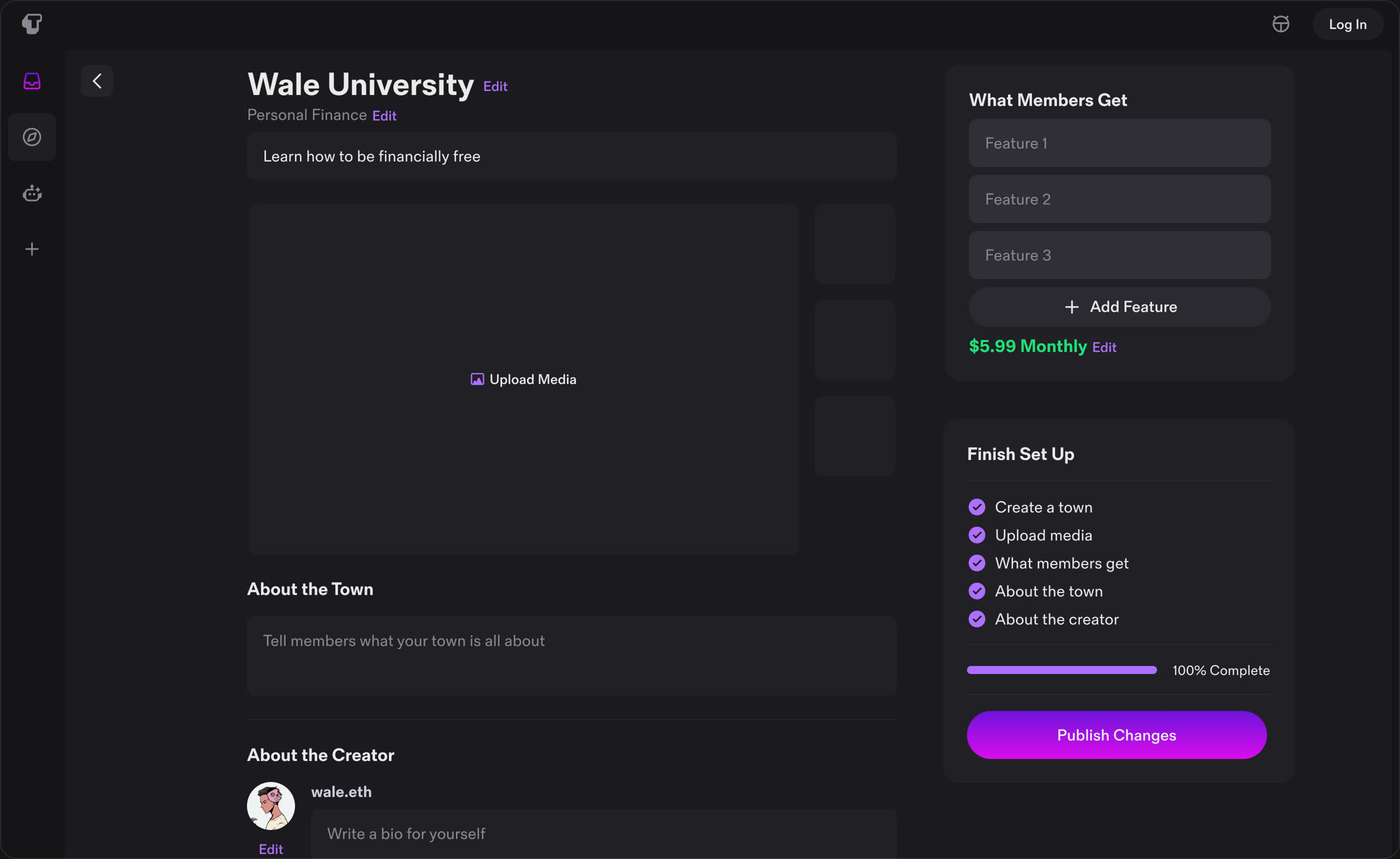
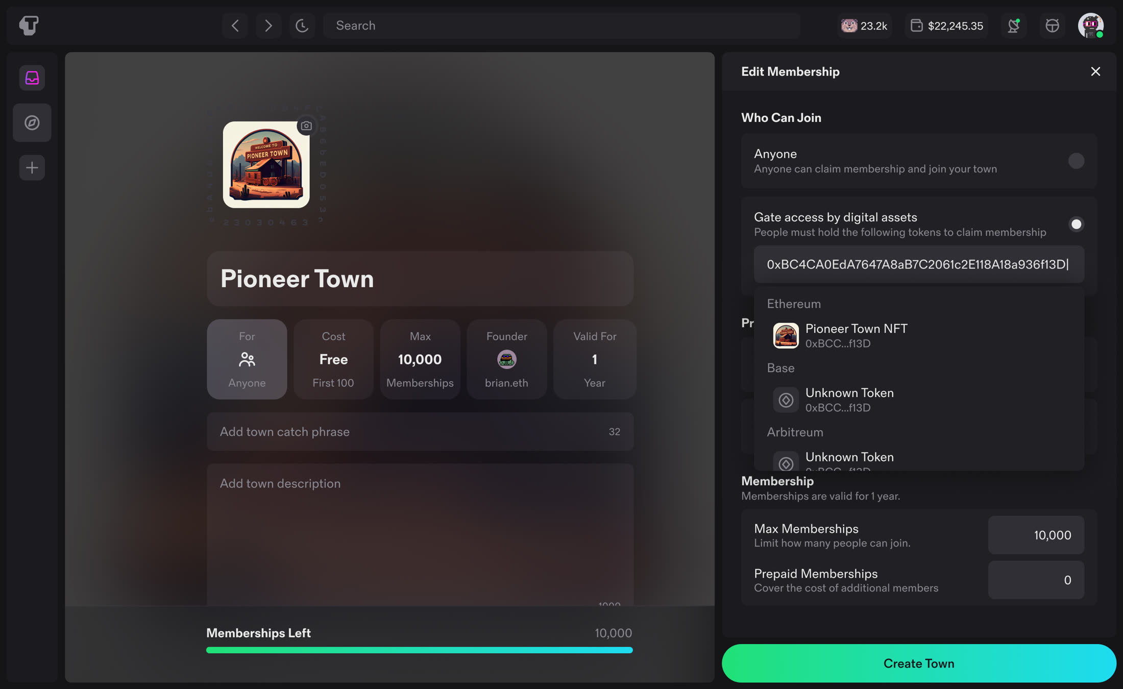 V1 · Before
Editing it afterwards
Everything else moved to town settings, available once the town exists.
Case study
Explore and discovery
The storefront for towns needed a rethink.
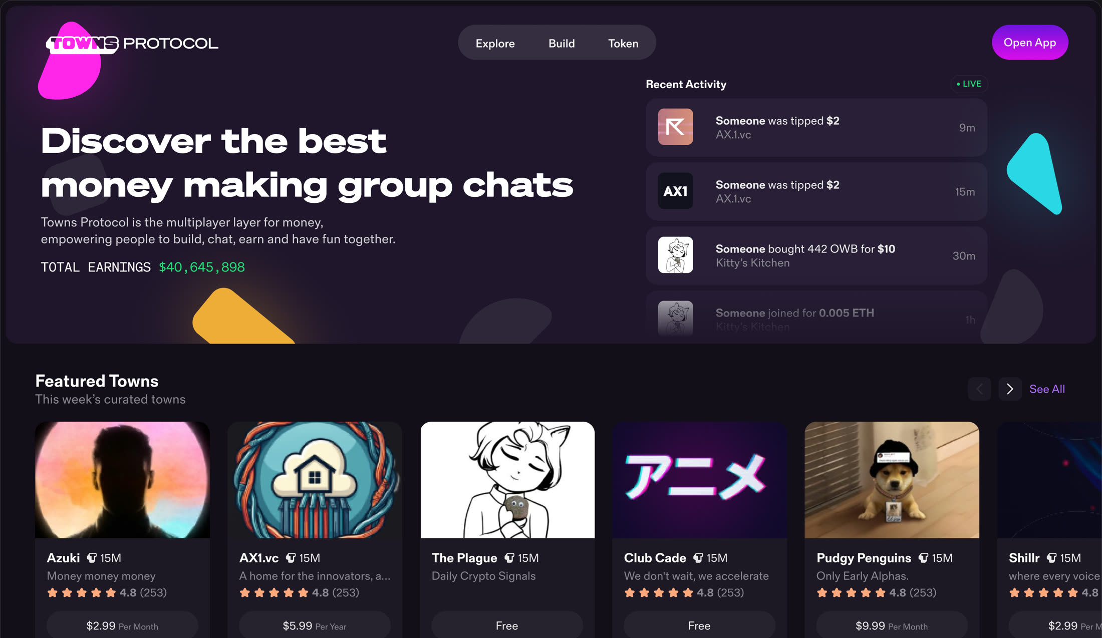
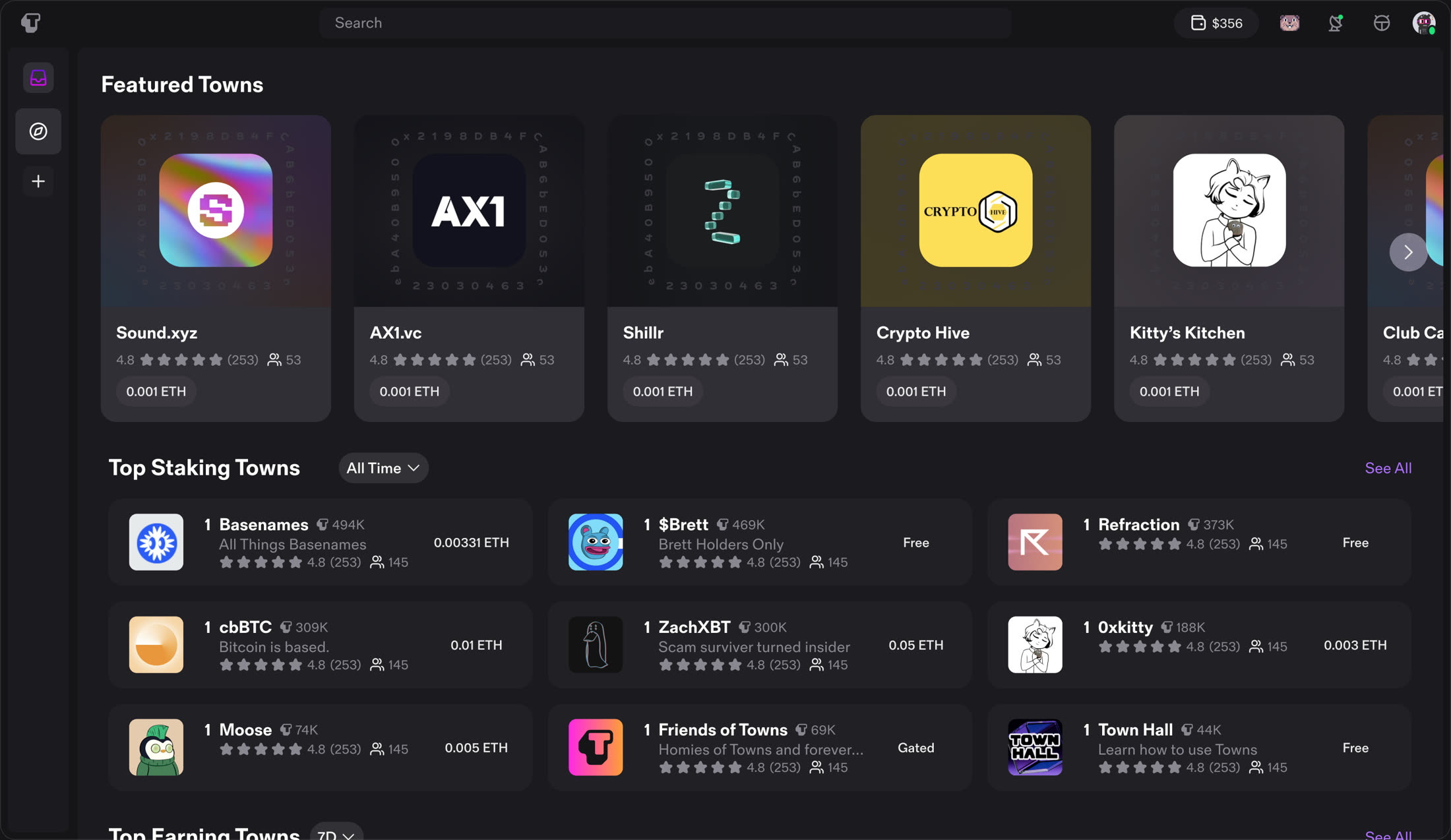 V1 · Before
The front page
V1 was functional and not much more: a row of featured towns and two leaderboards. V2 adds social proof with total earnings and a live activity feed, redesigns the leaderboards, and adds more categories.
Case study
Trading inside the conversation
Towns put a wallet inside group chat. The challenge was fitting market data, charts and orders into a messaging app without turning it into a trading terminal.
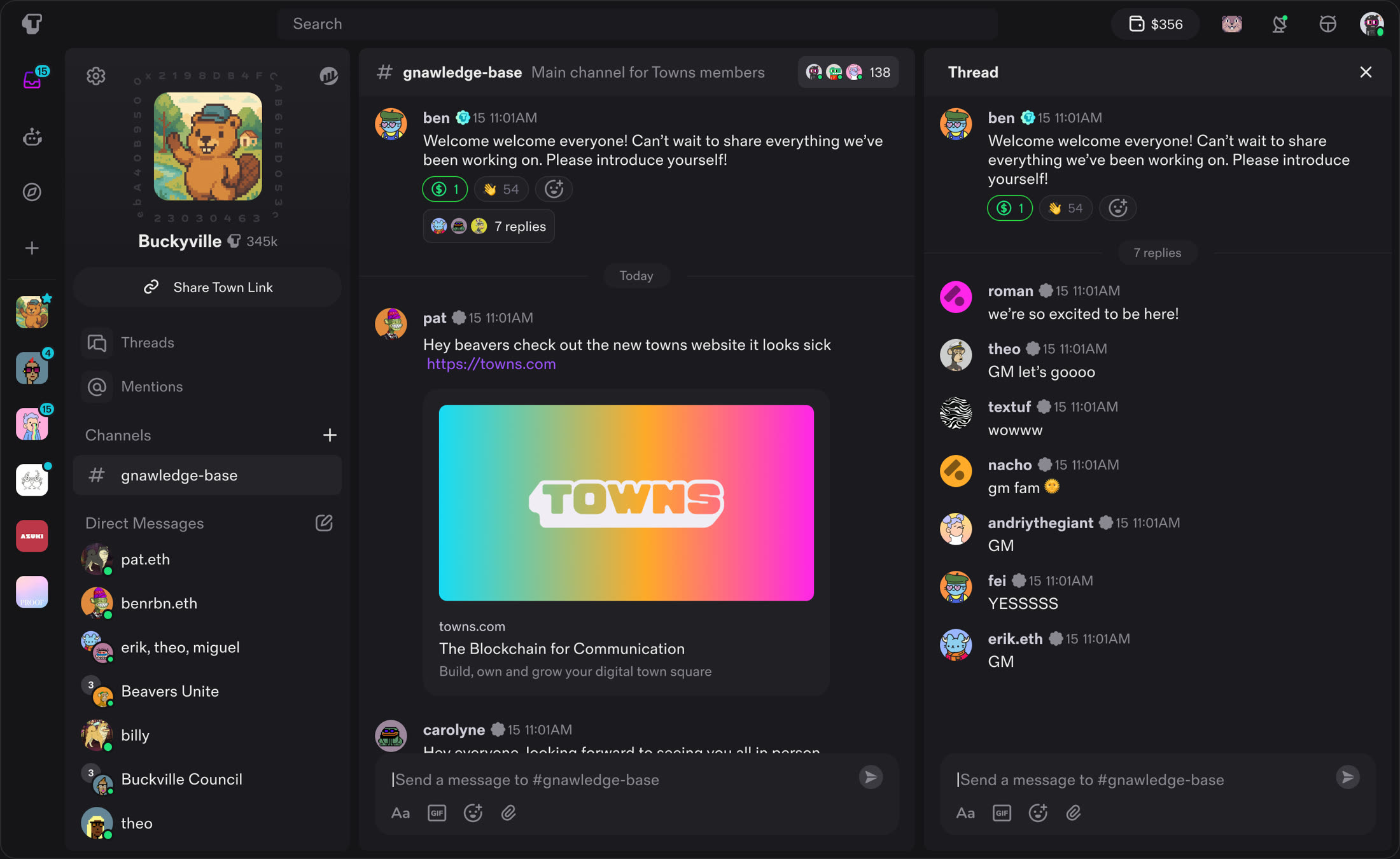
A panel system
Towns shows a lot at once: your towns, a town's channels, the conversation, and a thread. I laid it out as panels that get narrower and more specific from left to right, close to Slack and Discord on purpose, since members already had those open all day.
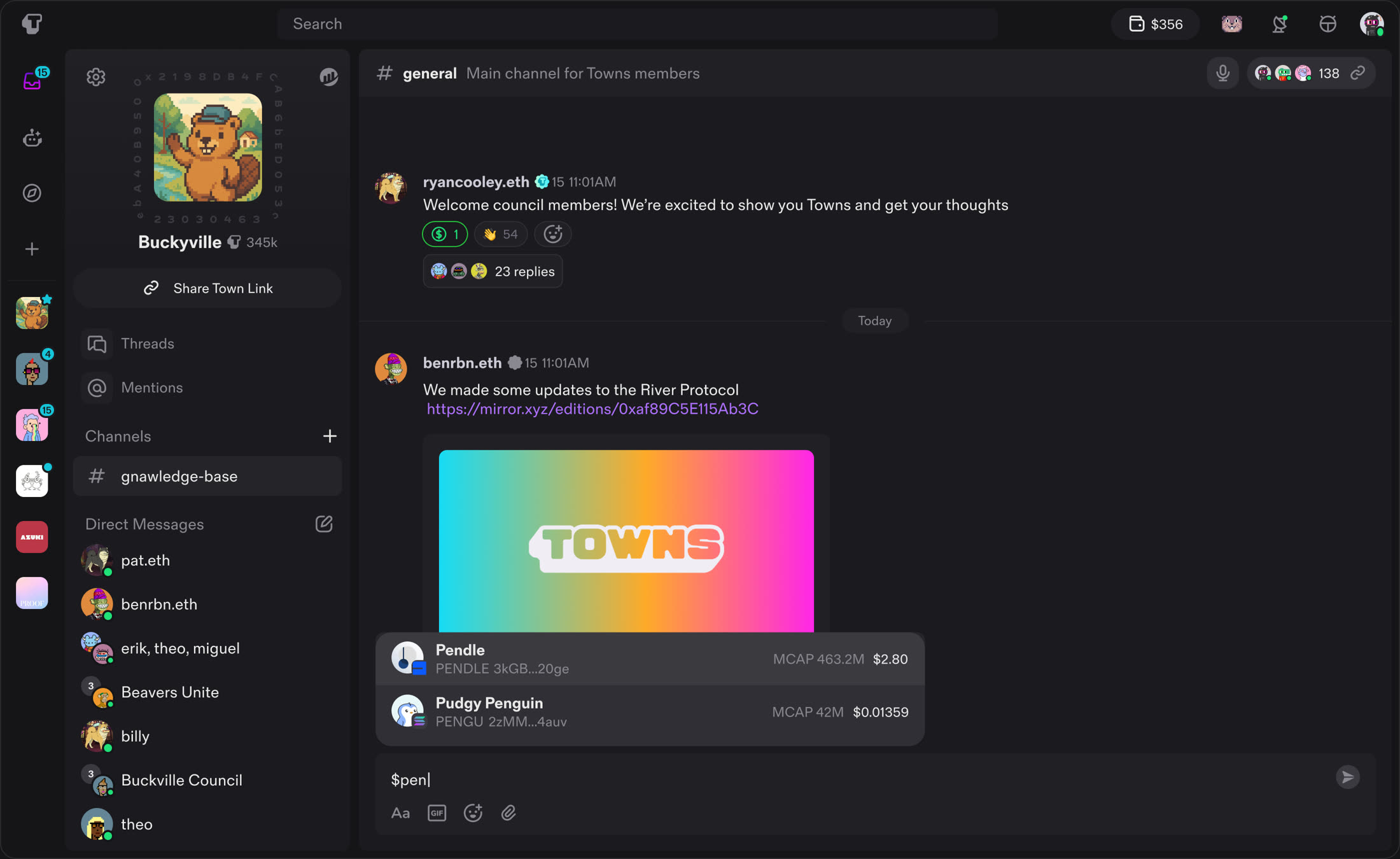
Type a dollar sign
Trading starts in the message box. Typing $ opens a ticker list that narrows as you type, so sharing a token is as quick as pasting a link.
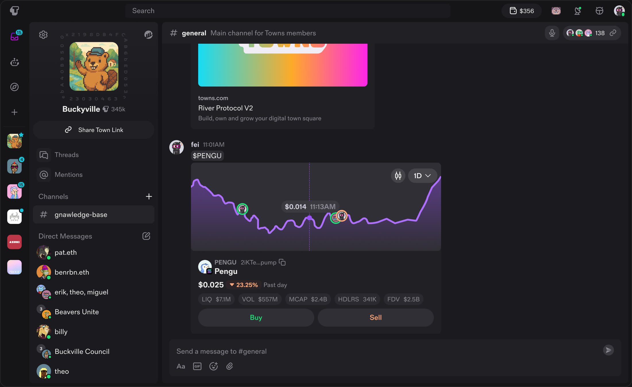
The chart posts into the room
A token shared in a channel unfurls into a live chart for everyone, showing who in the group is trading it.
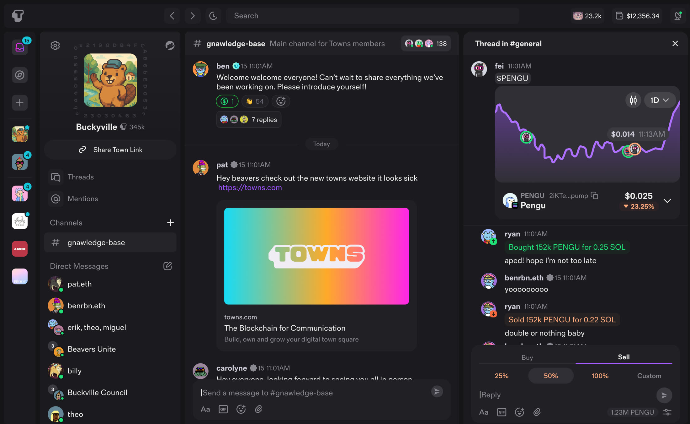
Open it without leaving
Tapping a chart opens it in a thread, so the chart and the conversation about it stay together.
Case study
The iOS app
Towns shipped on iOS and web. I designed the iOS app and worked closely with the iOS engineers through the build.
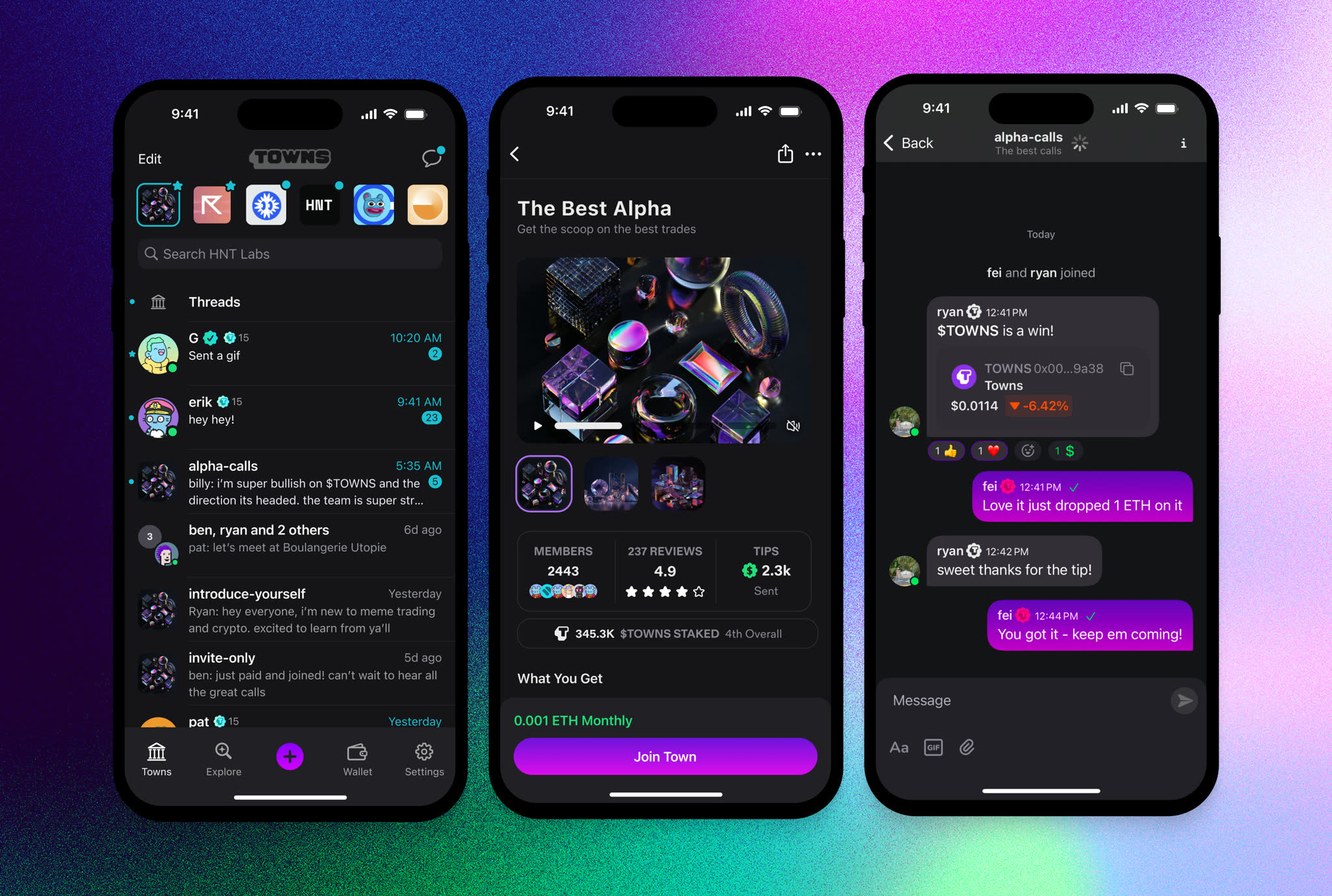
The whole product, on a phone
I restructured the hierarchy for a small screen and moved wallet and chat into the bottom nav.
Case study
Logo and brand
I designed the brand as well as the product.
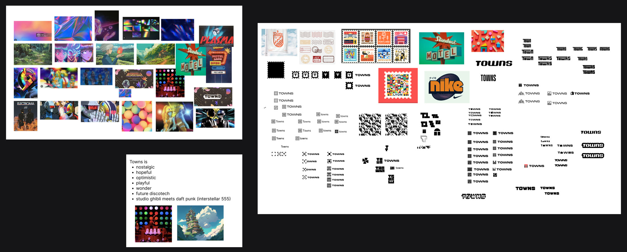
Start wide
Every brand I work on starts with a wall of references and a short list of words. For Towns the words were nostalgic, hopeful, optimistic and playful, and the reference we kept coming back to was Studio Ghibli meets Daft Punk. Then came dozens of small sketches to find what those words look like.
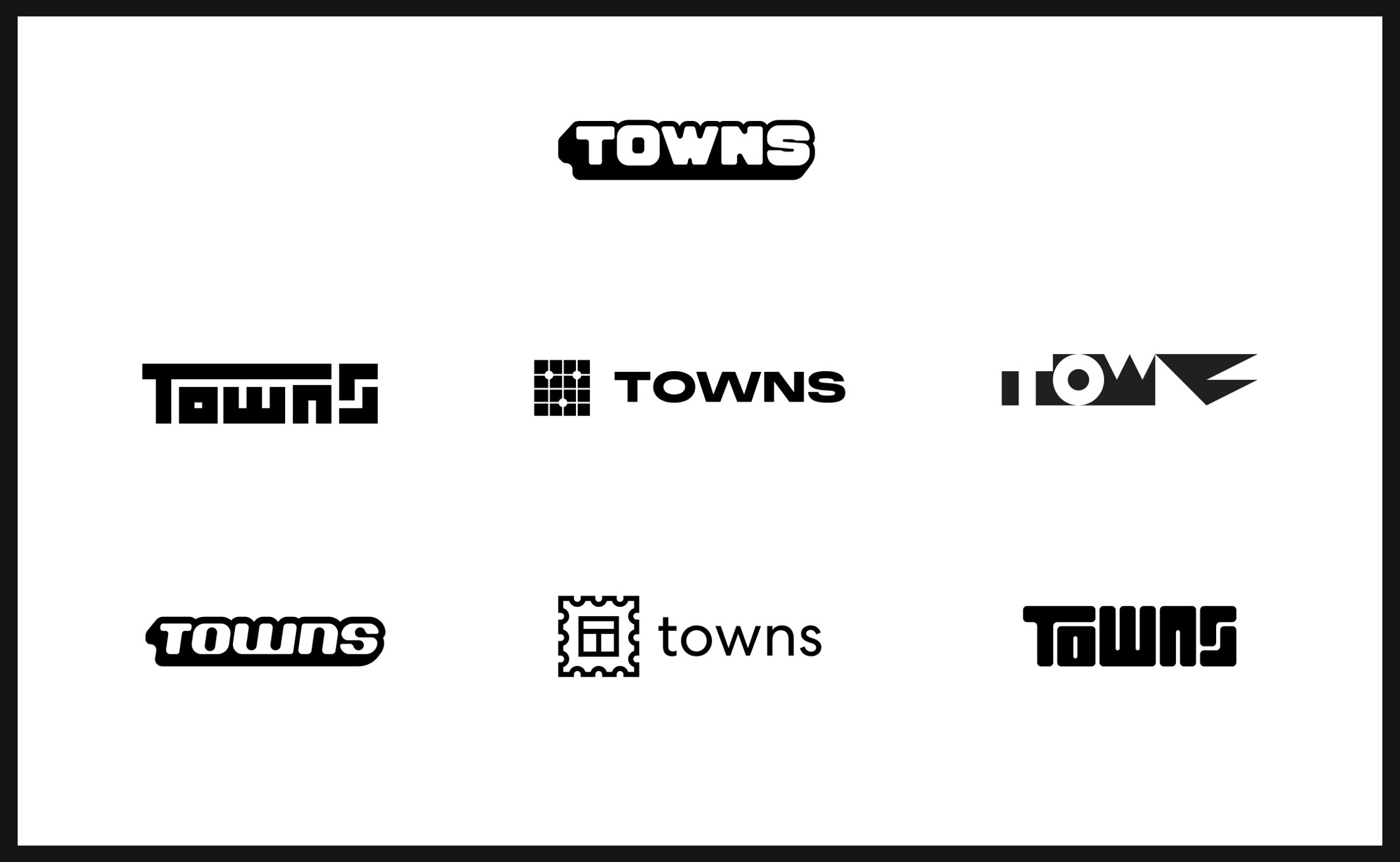
Narrow to options that disagree
I cut it to seven directions that were as different from each other as possible: pure type, a pixel grid, a stamp. Showing a team options that clash is the fastest way to learn what they actually want.
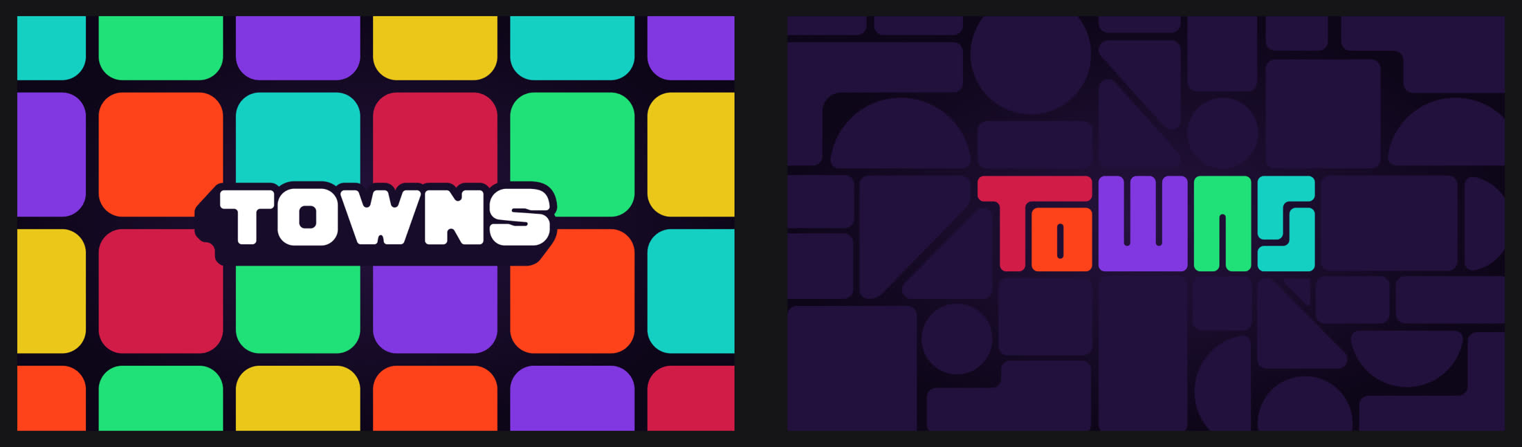
Test it in context
A wordmark on a white page tells you very little. I put the final two against the patterns, colors and surfaces they'd live on, which is usually where a mark breaks.
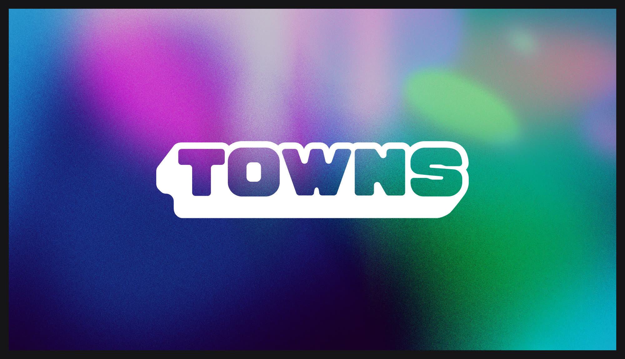
The mark
The outlined wordmark held up at icon size, in motion and over gradients, so that's the one we shipped.
In three dimensions
The final mark, built out for launch.